My Portfolio
Posters
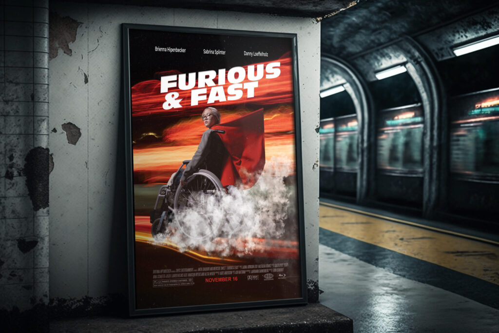
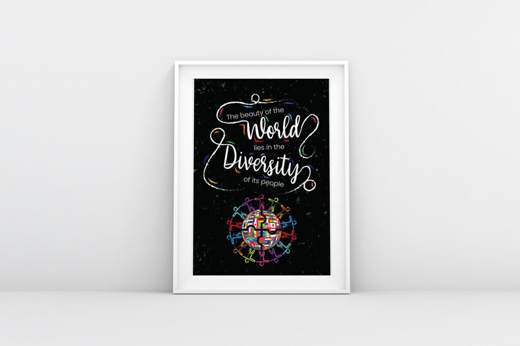
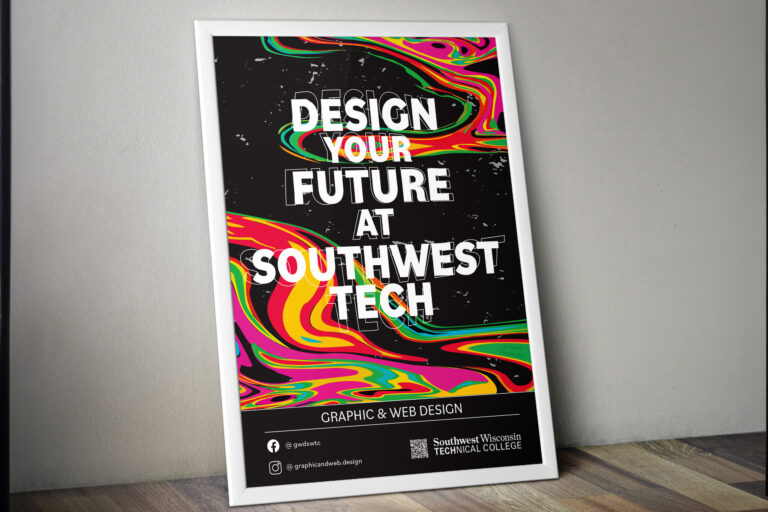
Below are three different poster designs I created. The first poster was created in my Pre-Press class for diversity week at SWTC. The second poster was a parody movie poster created in my Photoshop class. The third poster was created in my Typography class to get people’s attention in hopes of recruiting students to join the SWTC Graphic and Web Design program.
Magazine Designs
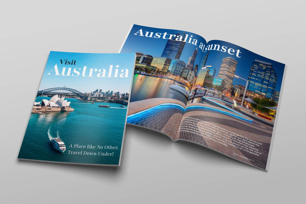
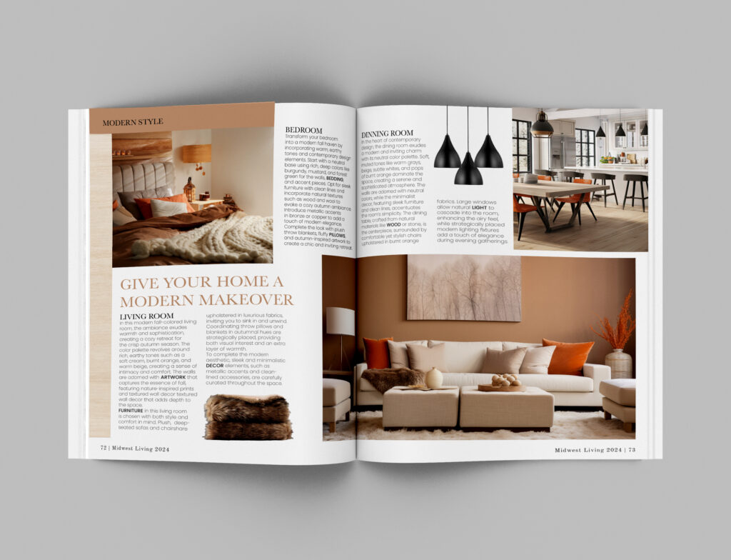
These magazine spreads were created using InDesign and Photoshop to mock them up. The image to the left on top was a travel destination magazine in which I chose Australia to showcase its natural beauty. The spread on the bottom was a redesign of a spread from Midwest Living magazine in which I chose a more modernized approach to make it feel and look more up-to-date and trendy.
Website Designs
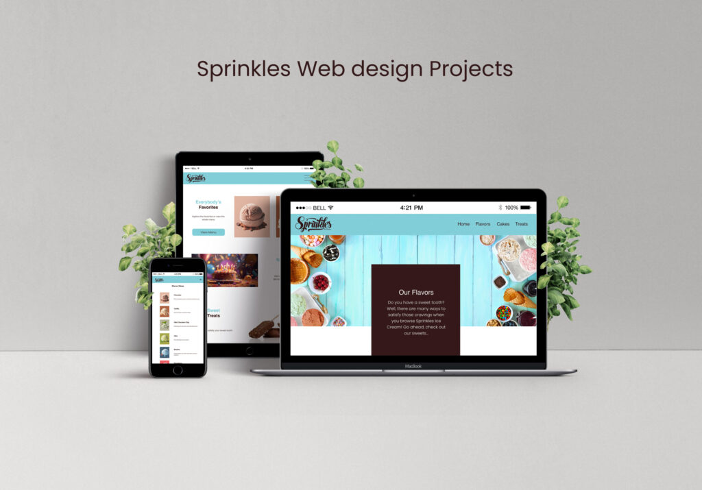
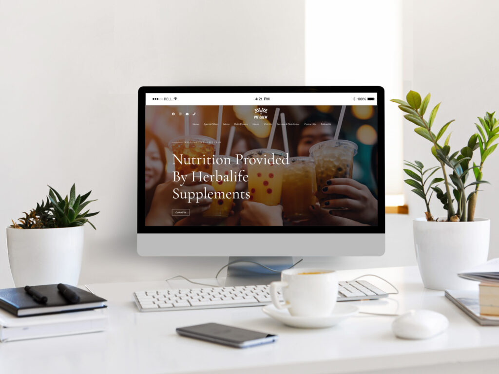
These websites were created during my second year at SWTC. The Sprinkles website was created using HTML & CSS. We were given a branding guide as to what the client wanted and had the creative freedom to create a site this fictional ice cream shop could utilize. The bottom Pit Crew website was created in WordPress. Our task was to find a business in our local communities and make them a mock website that utilizes actual products or services they offer.
Cereal Box
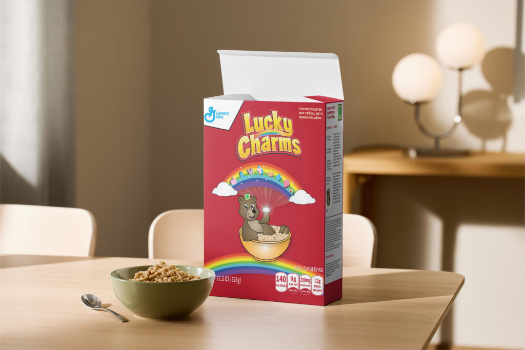
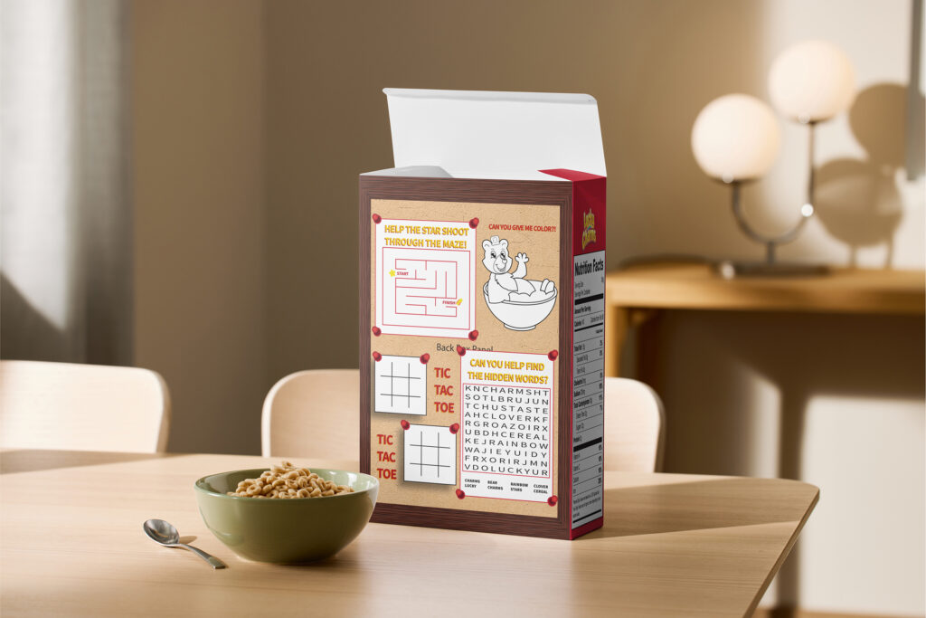
This cereal box design was created for my Illustrator class. I drew Lucky Charms and redesigned the brand as a bear and incorporated popular games onto the back for kids. We were provided with the logo and given the creative freedom to take whatever rebrand approach we wanted.
Black & White Photography
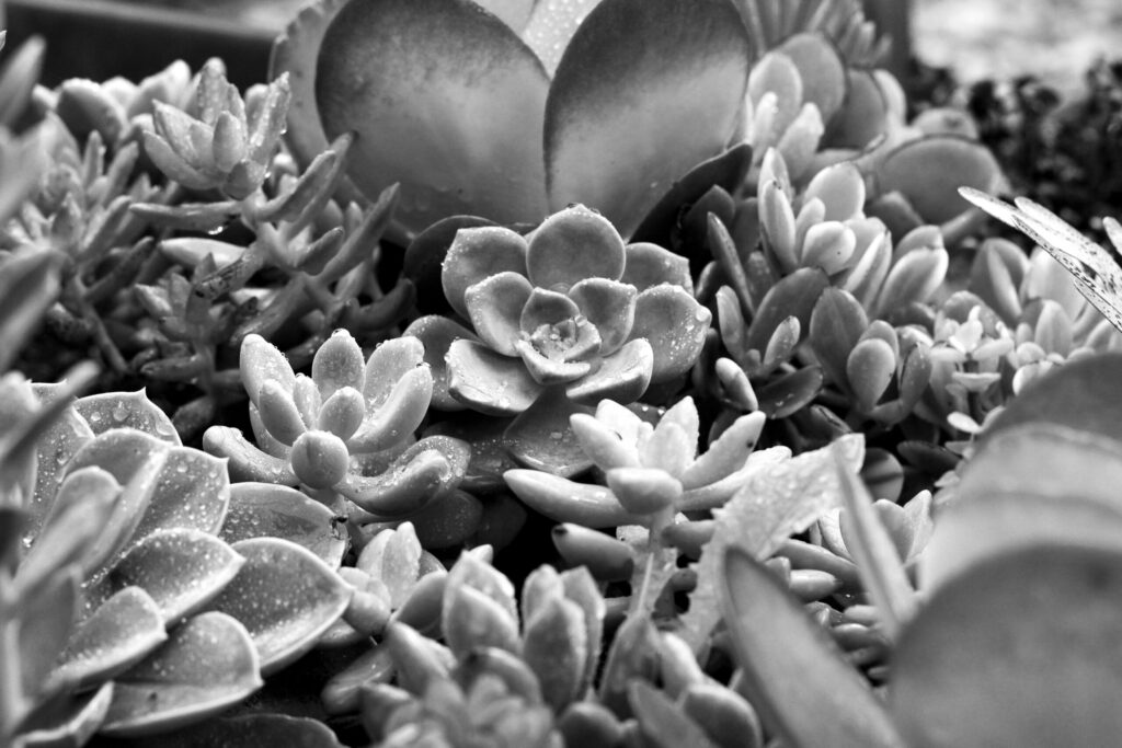
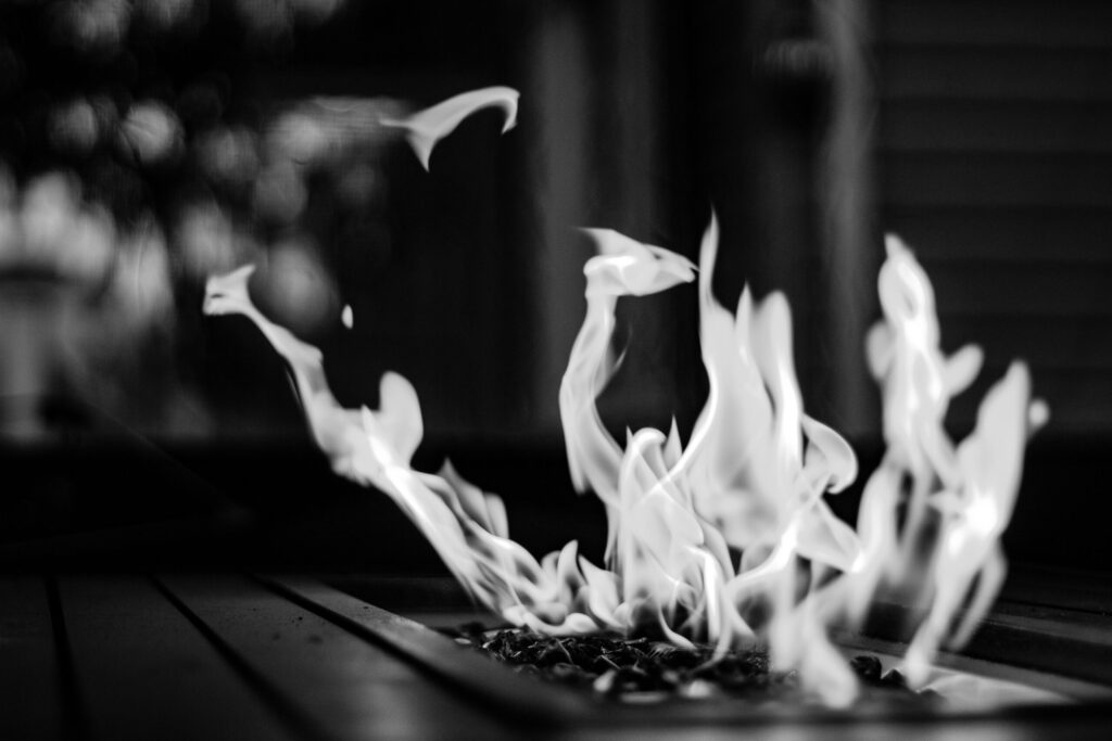
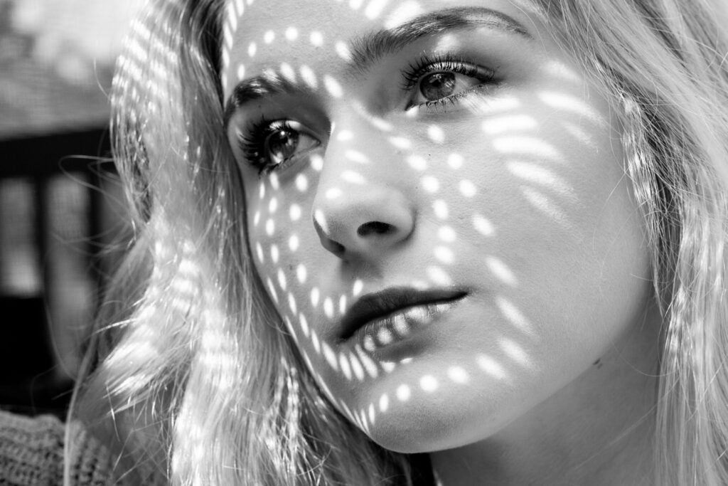
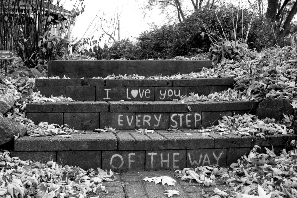
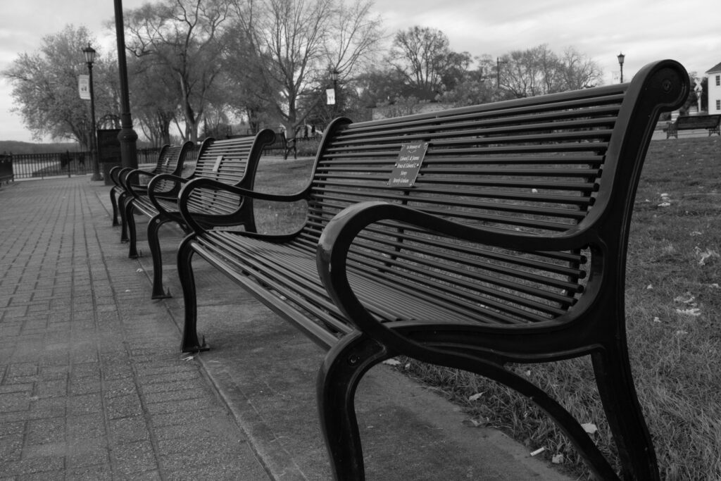
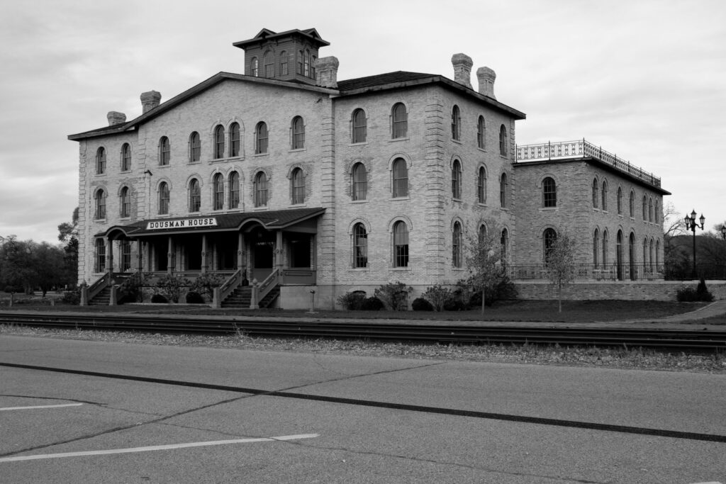
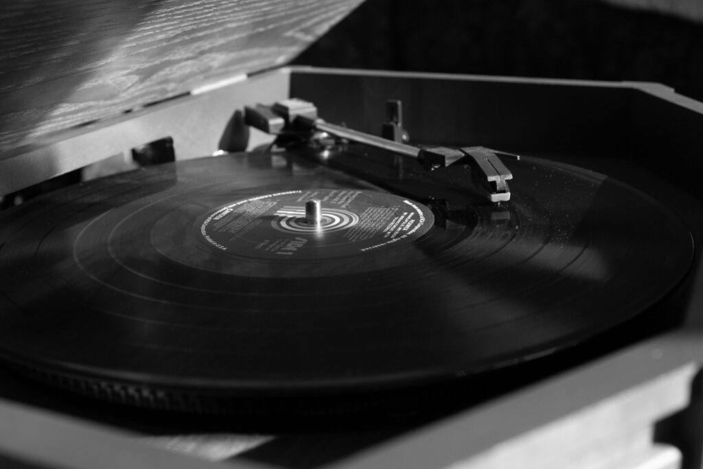
For my Intro to Photography class, we had to pick a theme and showcase our pictures. I chose black and white as my theme because I love the vibe that you can draw from black and white images. I feel they pack a punch with their dark tones and deep contrasts. They give off a moody and mysterious vibe.
Visit My Black & White Photography website: Pixieset
Bank Logo
This bank logo was created for my Typography class to utilize the correct design fundamentals as well as create a memorable piece that would help give us practice in the world of branding. The task was to come up with a unique and sticking design for a fictional bank called Forever Bank & Trust.
Product Guide
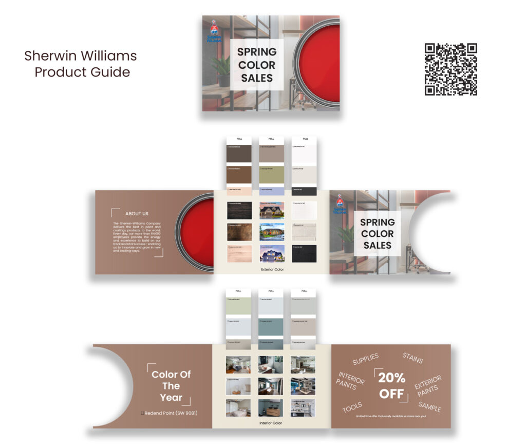
This project was created for my InDesign class. We had to choose a business and design a product guide geared towards the services or products they offer. I chose to do Sherwin Williams. I utilized their paint colors to create clever pull tabs with matching rooms to showcase each given color.
Big Dig Earthworx LLC
This project was created for a new start-up company in my local community. They wanted a more simplistic combination logo for their excavating business (Big Dig Earthworx LLC). I utilized Illustrator for my vector art and Photoshop for my mockup.
Crown Manufacturing
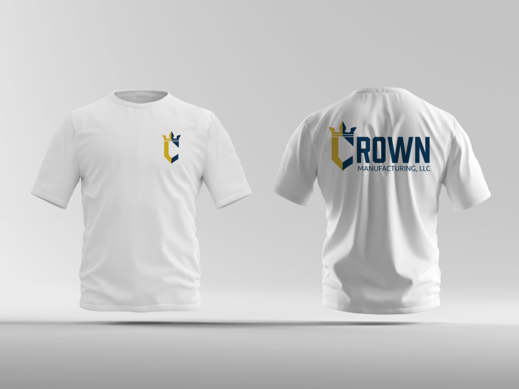
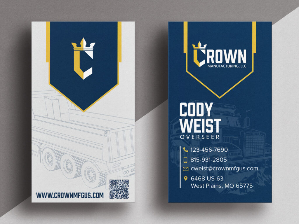
Below are just three of the pieces of work I have created for my internship via Crown Manufacturing, LLC. This family-owned company took me on to help them rebrand a manufacturing company. Throughout this rebranding process, I have completed their logo, clothing, business cards, and general branding guide. In addition to these pieces, I have also helped with building their landing page/website.
SWTC Billboard
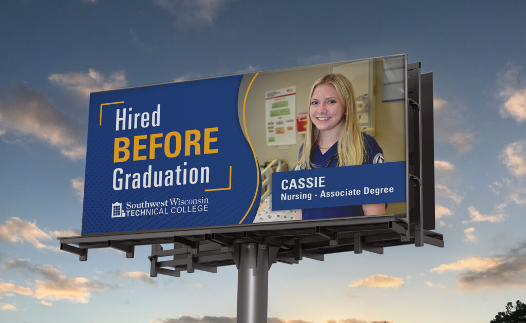
This billboard was created in my Photoshop class for the SWTC marketing department. I picked to create a billboard for students hired before graduation. My design was chosen by the marketing department and we put it up in towns all around the Southwest Wisconsin area to showcase some of these lucky students’ achievements.
Photography By Hally
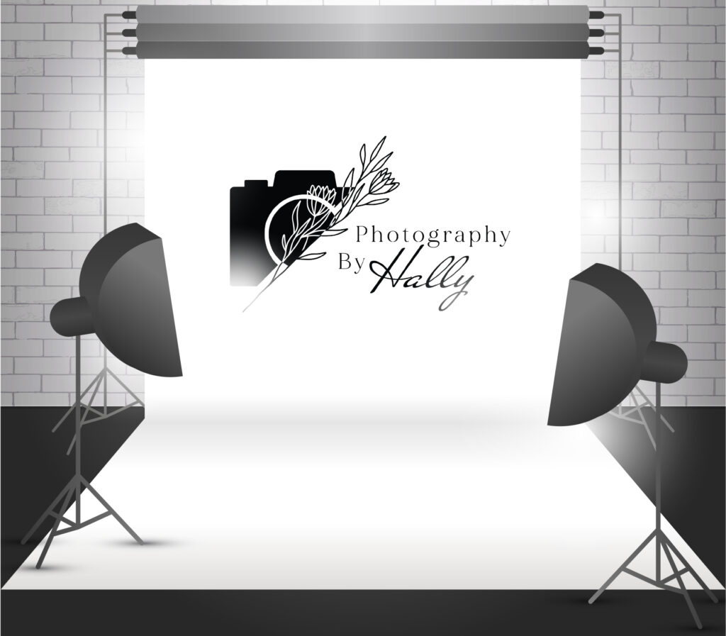
This logo was created for a small photography business in Prairie Du Chien. Photography By Hally is all about capturing life’s most precious moments. This logo was a redesign I created to showcase a more modern and simplistic branding approach.
T-Shirt Designs
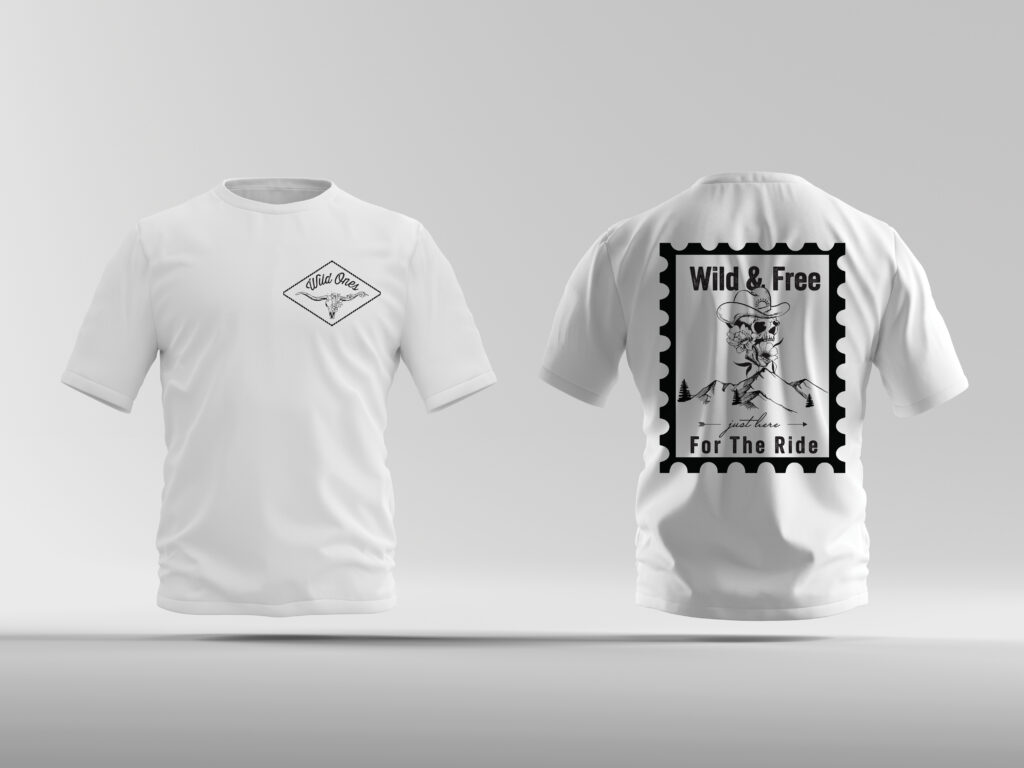
These t-shirt designs were created for my Pre-Press class as part of a project where we were given the creative freedom to create a shirt that would be marketable and profitable. I chose a cowboy rustic approach as well as a simplistic black-and-white color scheme to make it feel sleek and modern.
Lyric Video
This video was created for my After Effects class. We had to choose a song and create a lyrics video based on impressions we wanted to impose on our audience. I chose the song Skyfall by Adele. Watch the video below!
